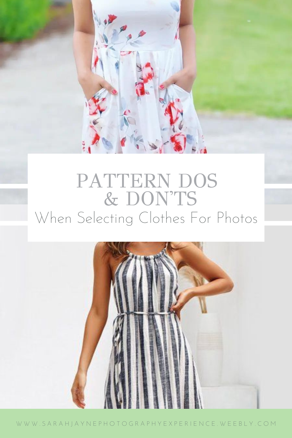
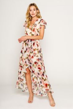
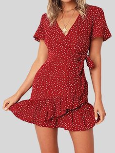
 Florals. Polka dots. Strips. Checkered. Patterns are so cute and add something special to our outfits but did you know that the size of your pattern matters when it comes to photography? It's true and I'm going to unpack the details for you today. Size Matters When it comes to florals and dots in particular, the size of the pattern is very important. Smaller flowers and dots don't show up well on camera and can end up looking fuzzy, which we don't want!
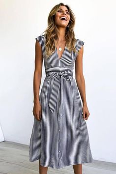
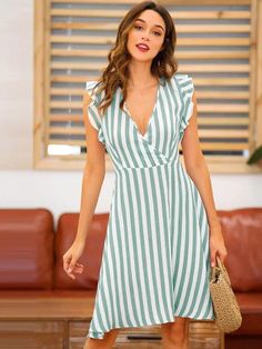
The one on the left is more what you would want to go for with a floral print. Now, you're probably thinking, "Sarah, the dots on the right look just fine." And you're right, they do. Sometimes it works out but sometimes it doesn't and you won't know for sure until after the photos so it's just best to not pick really tiny patterns. Stripes Thicker stripes are best. If the stripes are very thin, they tend to start blending. Honestly, it is hard for me to describe but if you go on Pinterest and search "striped dress", you can scroll and look through the options. If a dress makes your eyes cross and look like it's fuzzy, avoid strips like that! (You also want to get vertical stripes if at all possible because it helps you look thinner!)
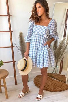
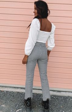
Can you see the difference? The one on the left looks distorted and fuzzy. We definitely don't want that in your photos! Checkered Clothes I'm especially a sucker for gingham! But as you're probably seeing by now, we need larger squares. The pants on the right are super cute but the squares are too small. If you loved checkered clothes, I would definitely recommend a dress or skirt, as larger squares tend to start looking less elegant on pants and shirts.
Don't Let The Pattern Take Control
There is a fine line between too small and overpowering. We don't want our patterns to be "in your face" because the point is not to focus on our clothes! What we are looking for is a balance and if your colors are light/neutral/pastel, you'll have an easier time with this. Please know that I am not against smaller prints in any way! I love them and think they are so cute but when it comes to getting photos taken, they aren't our friends. We are putting a lot of time, effort, and money into our photos and we want them to look the very best possible! So just like you would avoid bright, neon colors, keep your patterns in check (haha). You also don't want your patterns to overwhelm or steal the show. Your clothes are there to accent YOU, not to be the center of attention themselves. If you're ever unsure, just ask your photographer! They'll be able to give you a better idea of whether or not a particular pattern is a good bet or not.
0 Comments
Leave a Reply. |
Hi! I'm Sarah!
I am a natural light portrait photographer. I've been taking photos since 2014 and would eat a smoothie from Tropical Smoothie Cafe for lunch everyday if I could. Thank you so much for stopping by. I blog about sessions, things I'm learning, stuff in my life, and information for YOU, my client. If you like what you see around the site, I'd love to work with you! I'd also love to connect with you on Instagram. I'm @sarah_jayne_photo :) Archives
April 2024
Categories
All
|
 RSS Feed
