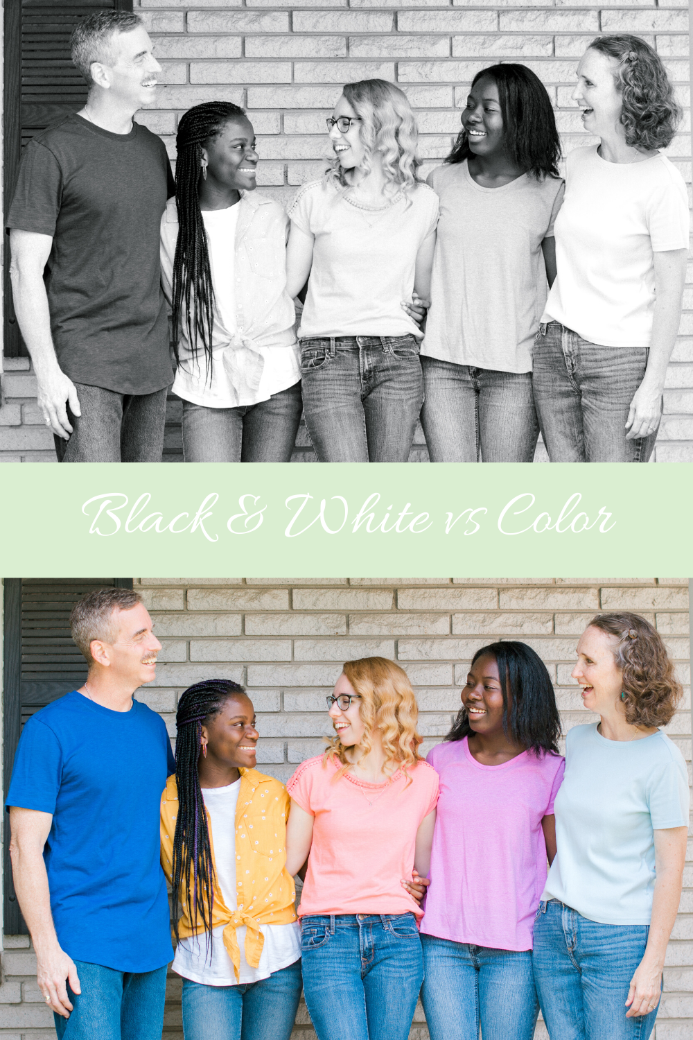
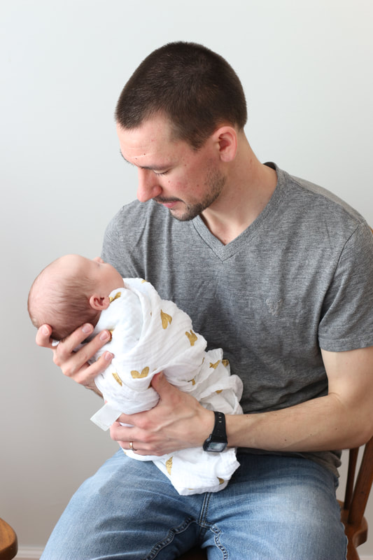
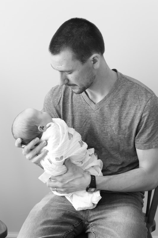
 A few weeks ago, I did a "this or that" post with questions I gathered from Instagram. One question was "black & white or color". It's an interesting question that doesn't have a good answer. I want to explain a little bit about why photographs kind of tell you which way they need to be. I realize that might sound crazy, but as I've edited, I start to know when a photo needs to be B&W. When you look at the photos above, you probably have a preference of which one you think looks better. Maybe they both have good things about them, but most likely, you are drawn to one over the other. Try to think about why that is. The way I do my sessions, I like a lot of interaction. Having my clients look at each other and laugh with each other. Doing walking or other movement poses. This makes their expressions more natural, captures emotion, and creates beautiful moments frozen as a photograph. Posed, smiling photos are great and beautiful but they don't show much emotion. It's going to sound weird, but when I'm editing, there are some photos that just scream B&W. Sometimes a B&W edit can remove distractions or other things that detract from the photo, but for me, I usually convert to B&W to emphasize emotion. For some reason, I have always found very emotional photos to better convey that emotion when there is no color. It's like everything else is stripped away and all you have left is what the photo is conveying.
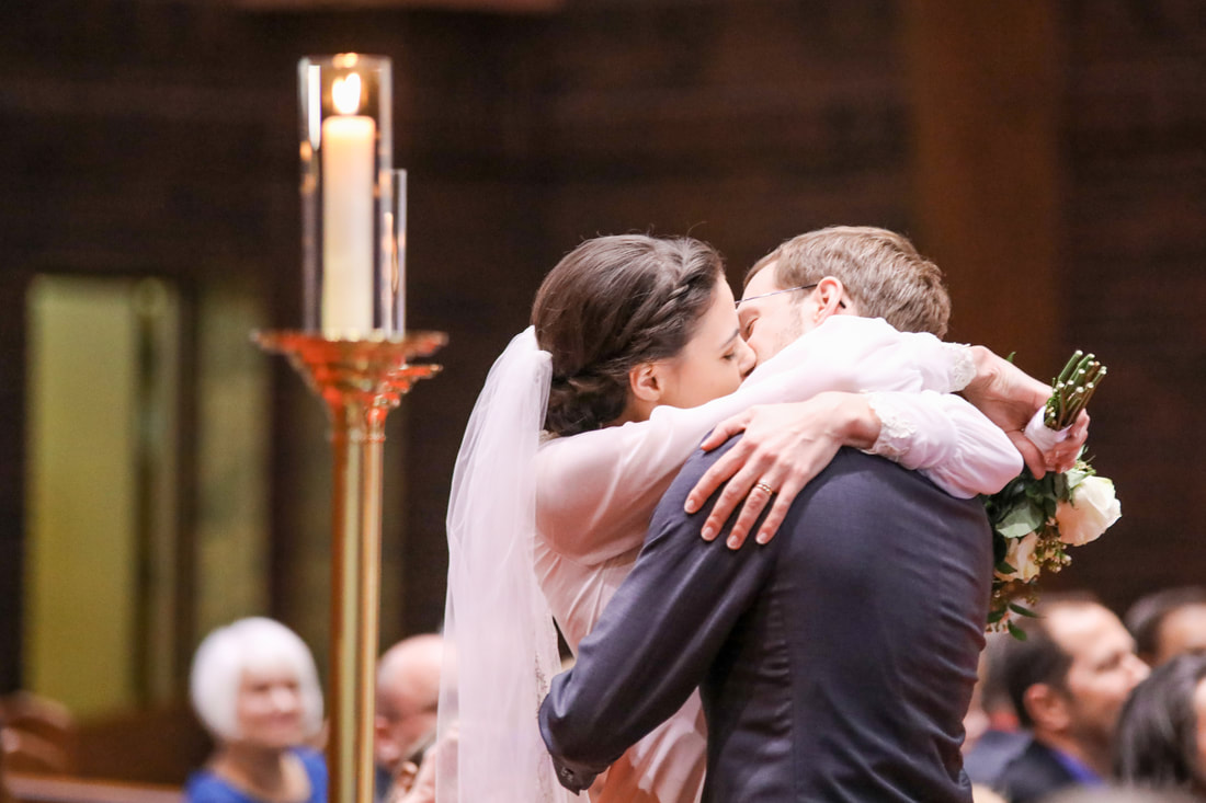 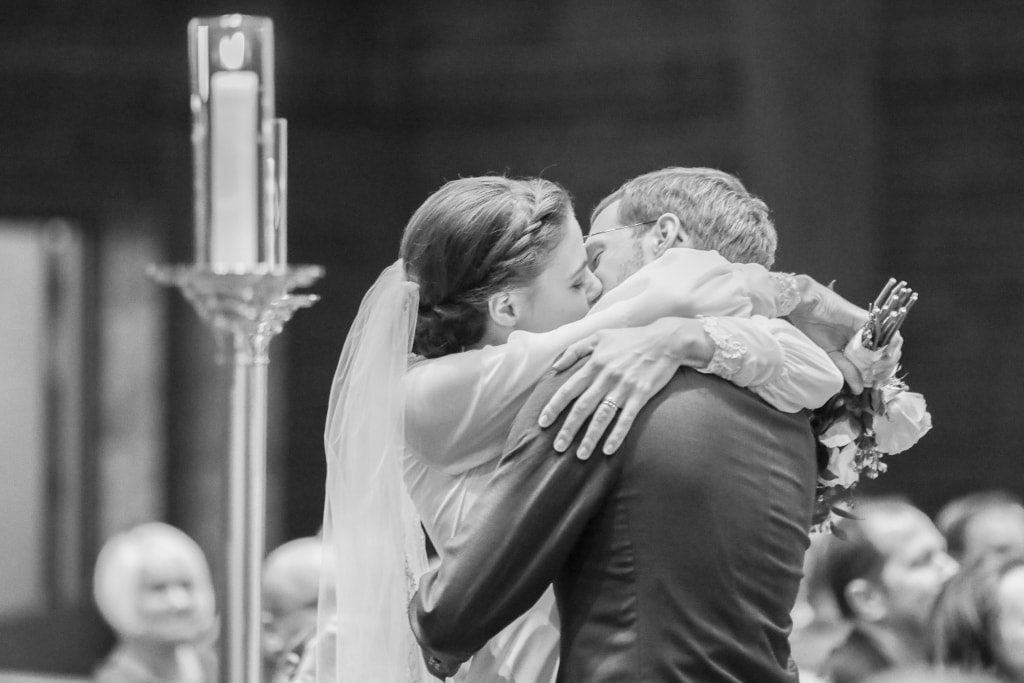 These images are some of my all-time favorites in B&W. To me, there is so much emotion but the color distracts from that. Maybe it's personal preference and it's also experience, but some photos just need to be in B&W. I wish I could give a better answer :)
When it comes down to it, I leave most of my photos in color. My standards for converting to B&W are usually one of the following:
I just want to add a note on the distractions. You might be wondering, "you're a professional. Isn't it your job to get rid of distractions during the session?" Yes, it absolutely is. Sometimes there are things outside of our control. For instance, I had a session where it started to drizzle near the end. I had some images that were really nice, but you could see the rain marks very clearly in the color version and they were hidden better when I made it B&W. Since I can't control the rain, my options were to cull those photos or hide the distractions. I'd love to know if you understand what I'm saying about emotion in B&W photos! Have you experienced that in your life?
0 Comments
Leave a Reply. |
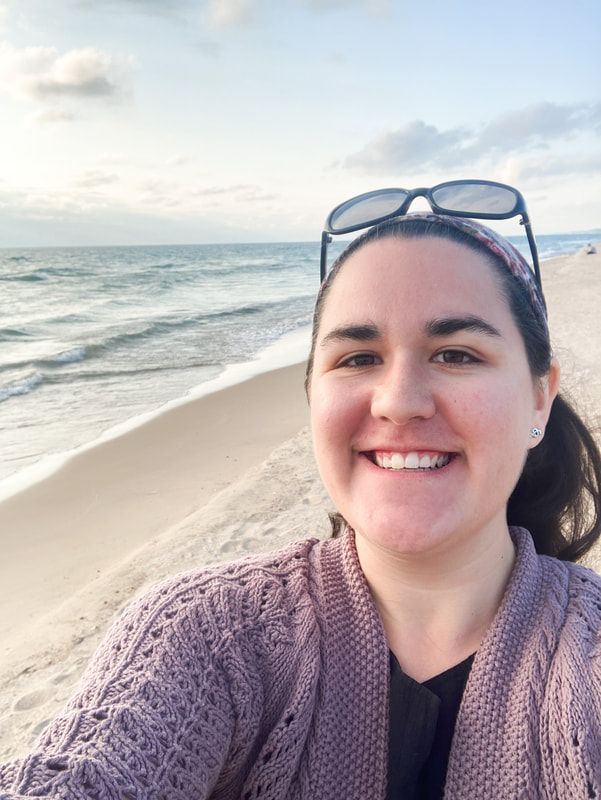
Hi! I'm Sarah!
I am a natural light portrait photographer. I've been taking photos since 2014 and would eat a smoothie from Tropical Smoothie Cafe for lunch everyday if I could. Thank you so much for stopping by. I blog about sessions, things I'm learning, stuff in my life, and information for YOU, my client. If you like what you see around the site, I'd love to work with you! I'd also love to connect with you on Instagram. I'm @sarah_jayne_photo :) Archives
April 2024
Categories
All
|
 RSS Feed
